ABOUT THE COMPANY & CHALLENGE
Hobnob enables users to craft chic, customized invitations, and effortlessly manage events directly from their smartphones. It offers both hosts and attendees a contemporary and hassle-free approach to event planning.
A rebranding effort for an app always carries inherent risks. Ill-considered alterations often lead to disappointing conversion rates, leaving publishers to grapple with the aftermath. Unfortunately, Hobnob experienced this firsthand. Despite its initial success as an app facilitating the creation and distribution of professional event invitations, a notable decline in performance followed its rebrand.
Recognizing the urgency to address this issue, the team turned to app optimization strategies. By partnering with Appxem, they sought to not only restore but also enhance their conversion rates, determined to overcome this setback.
EXECUTION STRATEGY
When we initially integrated Appxem for app optimization, our iOS app had been on the market for under a year, while our Android app development was in its nascent stages. Following a significant rebrand, the updated aesthetics adversely impacted the conversion rate of our iOS app, prompting urgent action and leading us to adopt Appxem for insights and swift optimization.
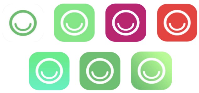
First Experiment on App Optimization
In optimizing Hobnob's app performance, understanding the impact of rebranding on user engagement was crucial. Without clear data on search impressions from Apple, identifying the most affected stage in the search-download funnel was challenging.
To initiate the optimization process, an icon test was prioritized. The icon's presence in both search results and on the product page made it a strategic starting point for enhancing user interaction and download rates.
Results revealed a significant improvement of 64% with a new icon design, characterized by increased brightness, depth, and visual appeal. Its enhanced visibility and dynamism surpassed the initial rebranded icon, indicating a positive impact on user engagement.
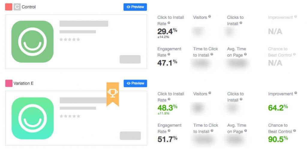
The successful deployment of our winning icon in the app store swiftly restored our product page conversion rate. We promptly extended the rebrand across our online presence, observing increased conversion rates across various inbound tools and heightened social media engagement.
Adopting the new icon and color scheme not only revitalized our brand identity but also significantly improved the efficiency of our tools. This single optimization effort had a profound impact on our business trajectory, underscoring the power of strategic app enhancements.
The transformative effects of this app optimization underscored its pivotal role in boosting our overall business health. Its ripple effects across multiple platforms demonstrate the substantial impact of even seemingly small adjustments in app design and branding strategies.
Second Experiment on App Optimization
In our rapid release schedule, we experimented with iOS icons and screenshots, often generalizing results across platforms. However, separate tests revealed differing impacts. While Android benefited from unified backgrounds in screenshots, iOS experienced a 20% conversion drop, prompting swift reversion.
Despite aligning with our new branding, the adverse iOS results necessitated a return to the original screenshots. This decision prioritized performance over aesthetics, highlighting the importance of data-driven optimizations in app development. The experience underscores the value of platform-specific testing and adaptation in pursuit of optimal conversion rates.Variation with a phone:
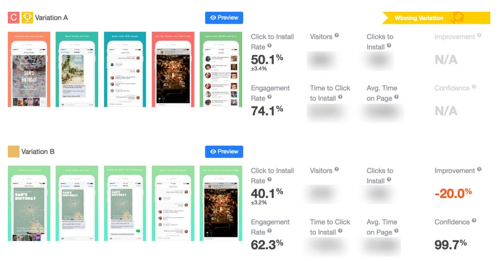
After integrating the outcomes from our icon and screenshot tests, our app conversion rate swiftly rebounded to its pre-rebranding level and continued to climb steadily.
Third Experiment on App Optimization
The reality of optimizing apps is that not every test yields a clear winner. From my extensive experience with Appxem, many tests didn't produce statistically significant changes, yet they offered valuable insights.
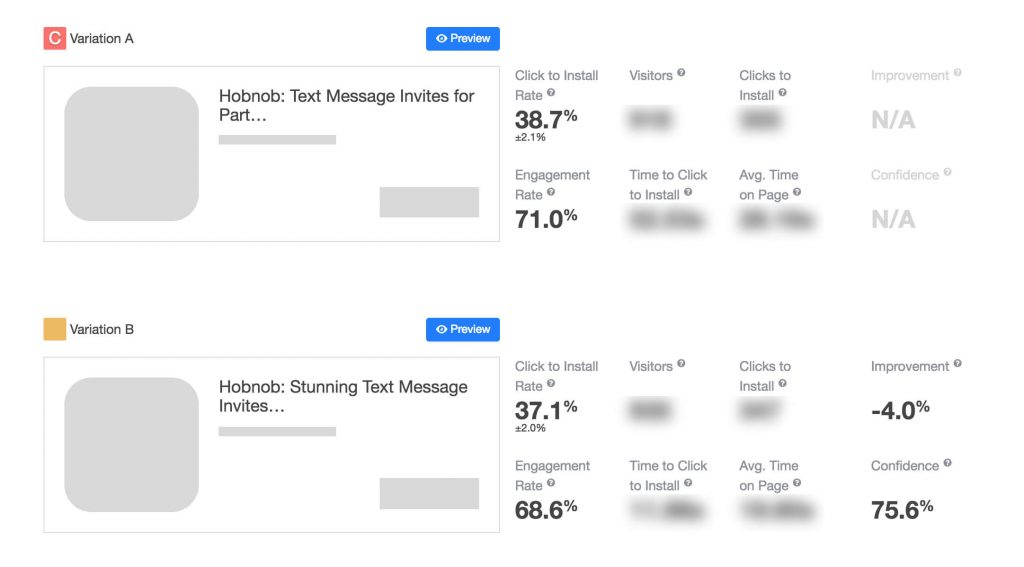
For instance, during a test on our iOS app, we examined how titles serve dual purposes: as a ranking signal for app optimization (ASO) and as a means to influence user decisions. Achieving a balance between these objectives became crucial.
After numerous experiments on title variations, it became apparent that neither the length nor the wording significantly impacted conversion rates. This suggested that the title primarily functioned as a tool for ASO rather than a medium for conveying the app's essence.
This realization allowed us to strategically incorporate our most important keywords into the title, resulting in a noticeable enhancement in our App Store search visibility.
Fourth Experiment on App Optimization
We decided to conduct the description test twice, witnessing a notable 13% enhancement in conversion rates on both occasions.
During our initial title test, we discovered that including "text message" in the title intrigued users and provided context for the rest of the app store description. With this clarity, we utilized the above-the-fold description to address the top three pain points that Hobnob addresses for event hosts, aiming to educate users about the benefits of our service and ultimately convincing them to download.
Optimizing the app's descriptions heavily relies on factors such as the product, growth strategy, and competition. Hobnob, being a need-based app, primarily attracts users searching for terms like "invitations" or "invitation app" on the app store, making our app store listing a crucial initial interaction point with potential users.
Hobnob encounters a distinctive challenge in the app store landscape, competing against two prominent players while offering a service that many are unaware of. Our text metadata must serve two key purposes: informing users about our product offering (e.g., sending invites via text message) and explaining the advantages of our service over others available.
Our approach to app optimization differs significantly from apps providing familiar services, as we need to educate users extensively on the benefits of our service to effectively make the "sale".
During our initial title test, we discovered that including "text message" in the title intrigued users and provided context for the rest of the app store description. With this clarity, we utilized the above-the-fold description to address the top three pain points that Hobnob addresses for event hosts, aiming to educate users about the benefits of our service and ultimately convincing them to download.
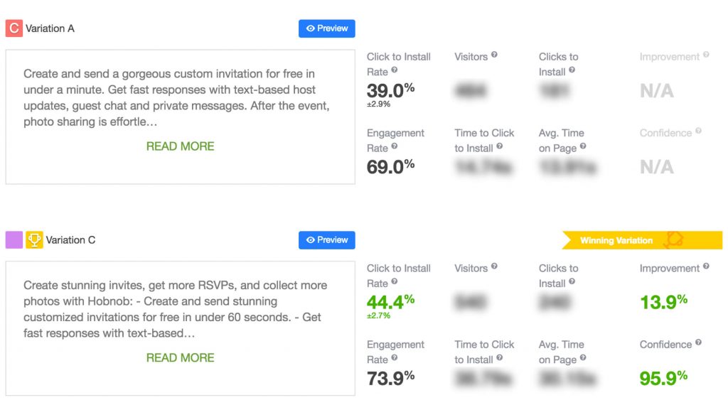
Test 1:
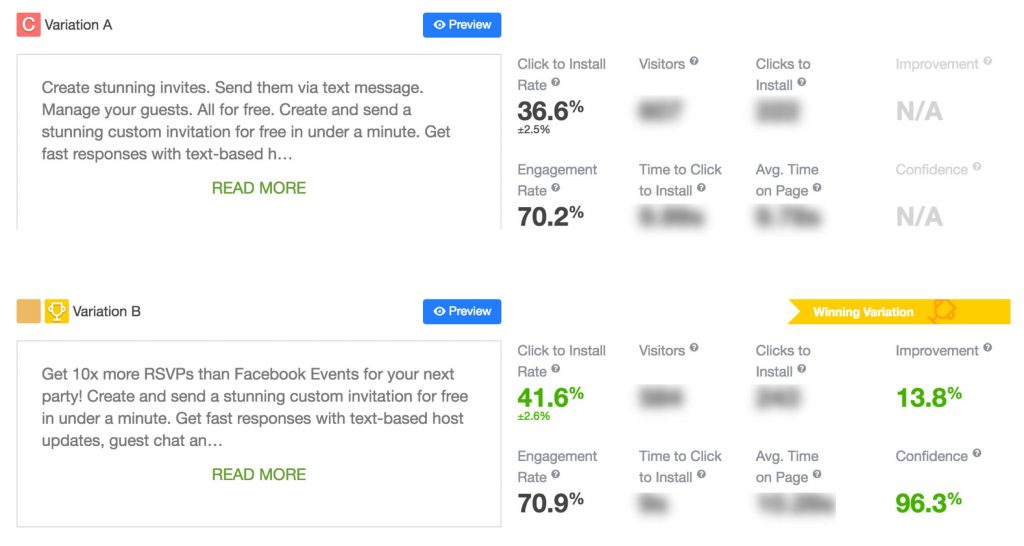
Test 2:
In general, our recommendation for optimizing your app is to thoroughly examine and deeply understand your users' path to discovering your app - their motivations, available choices, challenges, and what they seek. By comprehending the journey prospective customers undertake to reach your app's description, you can effectively convey the transformative benefits awaiting them once they download your app.
Fourth Experiment on App Optimization
Appxem provided the opportunity to:
1. Test the Android app, which was not yet live.
2. Gather email addresses during the pre-launch phase.
Appxem's email collection feature played a crucial role in the success of the Android launch. Prior to the app's release, Appxem helped to optimize every aspect of the Android listing and capture email addresses of users who expressed interest by clicking the "Install" button. This enabled them to compile a highly targeted mailing list of potential Android users before the official launch. Leveraging this list through a strategic email campaign, we achieved a remarkable 60% conversion rate from product page views to downloads. This exceptional outcome surpassed our expectations, propelling our app Hobnob to a strong debut in the Play Store. We exceeded our growth projections by several months, gaining a significant competitive advantage.
RESULTS
Over 5 months, Hobnob optimized their app using Appxem, improving app store conversion rates by 64% with A/B testing.
APP STORE CONVERSIONS
boosted app store conversion.
TAP-TO-INSTALL RATE
Description Optimization Increased Tap-To-Install Rate.
EMAIL COLLECTION
Bettered Email Collection In Android Listing.
CONVERSION RATE
Achieved 60% Conversion Rate.
REBRANDING
Icon outperformed rebranding by 64%.
Get A Quote
Revolutionize your online presence with Appxem's tailored marketing solutions. Maximize ROI, captivate audiences, and dominate the market. Your success begins here.